Showing posts with label tulle. Show all posts

Sunday, May 23, 2021

After the Storm

This is the latest piece that I've finished from a TextileArtist.org Stitch Challenge workshop. I know that I say that many of my art quilts are my favourites but I really, really love this one.

After the Storm


After the Storm

In March of this year, I made this piece following a workshop with Jette Clover, a Danish fibre artist. It's based on a photo taken after a snow storm this winter. 

A photo of my back yard after the snow storm

Our workshop was to create a piece based on a winter scene. I've often contemplated making a winter scene, but I had never gotten further that wondering "how in the world am I supposed to create a scene that's mostly white?" If you look carefully however, snow is not just white. There are usually shadows and the white sometimes has bluish or pinkish tinges, depending on the time of day and the weather conditions.

Details of After the Storm

I started by layering a flannel base with various fabrics and experimenting. A hand-dyed gray fabric went over the flannel. For the bottom, I used a piece of cotton lace from an old t-shirt, put a layer of batting and then added the lace on top. That was a lovely way of adding white without actually having to work too hard to give it texture 😊. I stitched on a piece of hand-dyed t-shirt on top of that - it had originally been an image of a bouquet of dried flowers so it had some lovely lines. Next came different types of tulle and organza - most of it had a lovely sheen that would be great for reflecting snow.


For the fence, I had a piece of cotton with pink, yellow and turquoise. On top of that came a piece of linen that I had dyed turquoise. It was an old skirt and I kept the stitching that was on it as part of the composition. I loved how it was curling and fraying. I also added a darker piece of gray as a line on the left. It sort of frames the piece and in the picture it's the window frame.

Once the pieces were mostly attached, I started stitching the branches. I used a running stitch of gray embroidery floss to outline them.

Outlining branches following the fabric

Adding the tree and its branches was the hardest part. I used a piece of batik and stitched it down with a button-hole stitch of a few strands of brown floss. I used the same floss to outline the tree branches. I then started covering the brown outlines with a DMC white Mouliné Étoile embroidery floss. It has a beautiful shimmer to it.

Adding the tree and then covering the branches with snow

I added lots of snow on the tree and fence top, the branches and around the base of the tree. I used a fluffy white yard to add snow between the tree and the lace. I thought that I needed something next to the branches and so added the snow covered bird bath. I used a piece of gray fabric covered with tulle and outlined in black.

Adding lots of snow and a bird bath.

Next came stitching the background with running stitch. I stitched the fence fabric vertically with a very light variegated thread that went well with the fabric. I used a variegated gray thread for the background. As I was stitching the background, it became obvious that the stamp had to be moved. 

What's with the stamp?

Jette Clover, our instructor, loves to add stamps to her textile art pieces. Since we were in the middle of lock-down and I didn't have any interesting stamps, I went to the Canada Post website and found a series of northern wildlife stamps. I chose the Arctic Hare stamp since it was more likely to be in my back yard that a caribou 😊. I made a photo copy of the stamp and attached it to a piece of brown cardstock. When I moved the stamp and was ready to finish the piece, I went to a post office outlet and bought a book of the northern wildlife stamps. I then attached the real stamp to a piece of green cardstock and placed it higher on the piece. It looks much better now!

Finishing it 

The piece has an irregular, organic shape that it didn't want to change. However, I did want to hang it somehow.

I ended up using a 10"x10" canvas and covered it with a remnant of stretchy velour fabric that I had been gifted. I need more experience covering canvas frames but this was pretty good for my first try. I want to do this more often to finish my art quilts. It really gives it a nice professional finish and hangs better than a sleeve, especially for pieces with odd shapes.

Finished piece, before adding it to a covered canvas

What I learned

  • It never ceases to amaze me how I end up adding fabrics and moving them around until it starts looking like something that I want. I don't really have any idea of what the piece will look like except that it should look a little like the photo.
  • When I'm  not sure of one part, I'll leave it and work on another part. If nothing seems to work - then it's time to leave it until I feel like picking it up again. Having it sit on my desk or my design wall usually helps me think of something.
  • You can see between the almost finished piece and the finished piece that I moved the stamp and added more stitches to the side gray border.
  • I really loved the DMC Mouliné Étoile. I will pick more up when stores are open again since I used almost the entire skein on this piece.
  • This was one of the four pieces that I had in the Fibre Fling exhibit last week. The other pieces were Exit Strategy, Big Mandala to Heal the World and Flower Impressions.

Related links


Linking parties
I will be linking up to many fun linking parties. Let's see what's going on in the quilting world! If you have any FMQ, link up to Free Motion Mavericks with Muv this week. Off the Wall Friday, Put Your Foot Down, Can I Get a Whoop Whoop?, Finished or Not Finished Friday and TGIFF, Beauties Pageant, Peacock Party, Patchwork & Quilts, Slow Sunday Stitching, 15 Minutes to Stitch 2021, Monday Making, Design Wall Monday

After the Storm was featured on Denise's Put Your Foot Down. Thanks Denise!

Project details


After the Storm

9" x 8½", mounted on a 10"x10" canvas 

Materials: flannel base, hand-dyed cottons and linen, batik, organza, tulle, lace, batting, embroidery floss, variegated thread and yarn, cardstock, stamp

Techniques: appliqué and embroidery


Wednesday, June 26, 2019

Gaïa's Garden

If you're interested, Gaïa's Garden is now on display at the Mississippi Mills Textile Museum as part of the Out of the Box (OOTB) artists group's Summer Fibrations Art Show.

Gaïa's Garden

It's been a long time coming. I've been thinking of this piece for about a year, wondering how I would make it.
Gaïa's Garden art quilt
I played with the placement of the fabric, one section at a time, until I liked what I saw. Some parts were easy while others were a real struggle. I'm not sure why. It may have something to do with expectations.

I suppose that this could be called the second in two series, depending on how you define the series. It's my second "fantasy garden" piece and also my second Gaïa piece. Here are the first in both series.

Morning Has Broken
Art with Fabric, Spring 2018
Gaïa Mother Earth
Art with Fabric, Fall 2017

Both of these were made for the Art with Fabric Blog Hops, Fall 2017 and Spring 2018.


Free Motion Quilting 

Free motion quilting (FMQ) this piece took a very long time. I had said that I would be using different threads, but in the end I decided to stay with the Kimono Silk thread. since it was going so well,.
FMQ all the fun details in the fabric
I remember that I started with bright yellow thread and worked on many, many pieces that needed to be FMQ in that colour. Then I got bored before I had finished with the bright yellow and changed thread and kept going to another part of the quilt. That went on for a very long time. Eventually there were only some small spaces left to fill in.

I love how the quiet space of the swamp came together
Solving a challenge

The trickiest part of this piece occurred just as I thought that I was almost finished. I had noticed that my image of Gaïa seemed to be a little lumpy. I decided that I would deal with it once I had finished putting all of the fabrics onto the piece. I ended up ignoring the problem until after the FMQ. Better to deal with it later....right?

It might not have been such an obvious problem if I had sewn down Gaïa a little more right from the start, but somehow I doubt it. All I know is that there was a largish space that had not been stitched while all around it was heavily stitched....you can see it coming, can't you?

Gaïa had many sags
I might not have needed Gaïa to be svelte, but she was sagging quite a bit. Well, I've always wanted to try trapunto, so I ended up making a slit at the back of the quilt and giving her a little padding. The first time I sort of overdid it, and discovered that although I had sewn Gaïa to the background fabric, I hadn't sewn around her once the batting had been added.

I overdid the stuffing of Gaïa
I almost never un-stitch or redo things. I usually try to find a way around the problem, however after sleeping on it, I decided that it was worth while un-stuffing poor Gaïa, and at the same time sewing around her through the batting.
I added the label on top of the opening.
Here is a final picture of Gaïa's Garden, taken on the way to delivering her to the Mississippi Mills Textile Museum.
Gaïa in her fantasy garden
What I learned
  • I'm not sure that re-doing the stuffing was worth it. After finishing the piece, it seemed to be fine but in the pictures, it looks a little off. As a friend said, Gaïa would probably have a few lumps and bumps, wouldn't she?
  • I am happy that I took the time to re-do Gaïa. If I want to take my art to the next level, I will need to seriously consider un-doing work more often. I generally know right away when a problem arises but I usually talk myself out of doing anything about it. 
  • I think that if I had sewn the image of Gaïa onto a fusible web, that it might have avoided the problem and kept the image flatter. On the other hand, if I had done that, I wouldn't have a 3D art quilt😊
  • I also need to plan my FMQ a little more when filling up spaces that really show. I had practiced drawing the stitching that I wanted in the sun but ended up starting the FMQ too quickly. I ended up only one side being what I wanted. I think that being a little more deliberate would have been worth it.
Related links
Post related to the making of Gaïa's Garden
  • Summer Fibrations Art Show, June 23, 2019
  • Gaïa's Garden is coming along, June 2, 2019
  • Making Gaia's Garden, May 20, 2019 
  • FMQ practice and planning, April 20, 2019

  • Linking parties
    Gaïa's Garden has been my One Monthly Goal (OMG) for both May and June. I'm really happy to be linking up to the June Finish of the OMG. I will be linking up to Muv's Free Motion Mavericks as well as many other great linkup parties. Let's see what's going on! Moving It ForwardMonday MakingWhat I Made MondayTuesday Colour Linky PartyLet's Bee SocialMidweek MakersWondering Camera, Can I Get a Whoop Whoop?, Finished or Not Friday, Friday Foto Fun, TGIFF, Off The Wall Friday, Main Crush Monday, Favorite Finish Link-up in June, June's UFO and WIP Challenge,

    Project Details


    Gaïa's Garden
    20" x 22"
    Materials: hand-dyed and commercial cottons, silk, tulle, gauze, silk thread
    Techniques: appliqué, free motion quilting, trapumto, improv piecing

    Monday, May 20, 2019

    Making Gaïa's Garden

    After a bit of productive procrastination, I'm back to working on my art quilt.

    Gaïa's Garden

    It's always a long process, so I thought that I would share some of it with you. Here's a recap (see Related links below).

    My model for Gaïa
    My model for Gaïa
    Choosing a colour palette
    Choosing a colour palette
    My model for Gaïa is this picture of a reproduction statuette of a beautiful Pre-Columbian female figure from Colombia, South America.

    I used photo transfer medium to make the fabric image.

    Gradients Multi
    33366 11D Moda


    It took me a long time to start because I was looking for the right fabric, which I found in the Gradients by Moda line.

    Fussy cutting and trying out possibilities
    Fussy cutting and trying out possibilities
    Next I went through my stash and fussy cut fabric, including the background. I just placed them on the design board to get the general effect and to ensure that I had enough fabric.

    That's where I was in my last post, with lots of work left and many possibilities.

    The next part is the one I find most intimidating - taking everything off the design board and creating the background.

    I attached the sky (including my hand-dyed yellow and pink cotton), the green background and the river. Then it was time to play with the colours. I took out my box of gauze, tulle, and silk.

    It's difficult to see in the photo but the sky and river really shimmer. I separated the river into 3 sections - the reflection of the sky, a more turbulent riven and then a calmer lake.

    Knowing what to keep
    Creating the background and adding shimmer
    Creating the background and adding shimmer

    From the many versions on my design board, there were a few things that I knew that I would keep.

    These were the leaves beside Gaïa and the large plant, flowers and bird in this photo.


    It took several tries to get the other side of Gaïa finished. My original thought was to use the light leaves. I also tried out some yellow/orange leaves but they just blended into the reflecting water. Finally I choose the darker blue leaves to create more contrast. Since the image of Gaïa is light, she needs a little help to stand out.

    Should I use the light coloured leaves?

    What about the yellow/orange leaves?

    Finally choosing the darker blue leaves
    Below you can see that I added a couple of leaves on top to create a curve.

    My next two challenges can be seen in this image. The first one is by the river where I want to create a quiet space with a bit of a swamp or pond. The second one is the lotus flower at the foot of Gaïa. This is where I'm at, although I can still change my mind since the challenging pieces haven't been attached yet.
    What it looks like so far

    I'm working mostly from my design board which is on my ironing board. When I like something, I just pin them into place and go to the sewing machine next to it. I've been using Superior Threads' Kimono Silk thread to attach all of these pieces. I'm trying not to add too much detail at this point since once everything is attached, I'll be free motion quilting the piece. At that point, I may use heavier thread, depending on the effect that I want.

    Working on my design board
    Using Kimono Silk thread

    What I learned

    • Deadlines have their usefulness (I guess) but since I got a bit of a reprieve, it's taking that much longer to make. Turns out that the description was due in mid-May but the final product is only due in mid-June. I'm afraid that I'll be using every last minute of that extra time - to make it and to productively procrastinate 😉 
    • There is still a ways to go, although it usually goes a little faster once things fall into place.
    • As I've been writing this post, I realise that I'll be placing the swamp in the lake part of the piece. It make more sense, although reality is not especially important here! 
    • As for the lotus flower, I think that if I add more fabric around it, I'll get a better sense of how it will look.
    • My background has a few puckers in it. Since I'm making this up as I go along, I'll probably cut around the river and adjust the fabric.
    Related links
    Linking parties
    Although I haven't started quilting yet, I've sure been using my FMQ skills to stitch all of this fabric down. I'll be joining Muv at last week's Free Motion Mavericks, as well as many other great link-ups. Let's see what's going on this lovely Victoria Day weekend. Oh Scrap!, Monday Making, Main Crush Monday, Design Wall Monday, Moving It ForwardTuesday Colour Linky PartyMidweek MakersFinished or Not Friday and Friday Foto Fun, Off the Wall Friday, Favorite Finish Monthly Linkup

    Remember to link up any quilting projects on Thursday when I'll be hosting Free Motion Mavericks! See you then 😊

    Sunday, February 24, 2019

    Travel, Art and a DrEAMi!

    This week I traveled to Montreal by train to see some great art, eat wonderful food and spend some quality time with my daughter.

    Kent Monkman
    Shame and Prejudice
    A Story of Resilience

    On Thursday, we saw Kent Monkman's exhibit, Shame and Prejudice - A Story of Resilience, at the McCord Museum. Kent Monkman is an amazing First Nation artist and storyteller. His work is funny, sad, colourful, provocative and socially relevant. I went through the exhibit twice - first by myself and then with my daughter, who answered my questions. It was great to be able to discuss this exhibit with her. If you're interested, check out Kent Monkman and the exhibit in the Related links below.

    Montreal Museum of Fine Arts

    Wire Mobile by
    Alexander Calder
    The next day we spent several hours at the Montreal Museum of Fine Arts. I've been there before to see special exhibits, but this was the first time that I took the time to go through the rest of the museum. 

    The special exhibit was on Alexander Calder: Radical Inventor. Alexander Calder was an American artist who had a degree in mechanical engineering. He went to Paris during the 1920's and hung out with all of the artists, writers and musicians of the time. 
    Calder metal mobile with a blue wooden background
    A fun and colourful fish mobile
    made of wire and glass by Calder


    Silkscreen printed fabric by Alexander Calder (1949)

    He was very versatile and worked with all kinds of materials, especially metal. He is well know for his circus pieces as well as the creator of mobiles

    Calder even made jewelry and designed fabric. This is one of two silkscreen printed fabrics that he designed in 1949. The motif reflects his mobiles as well as the shapes that he used in his work. 

    Isn't that fabric wonderful? It looks like a retro pattern from the 60s! His work may not seem like a big deal today, but he was a man ahead of his time.


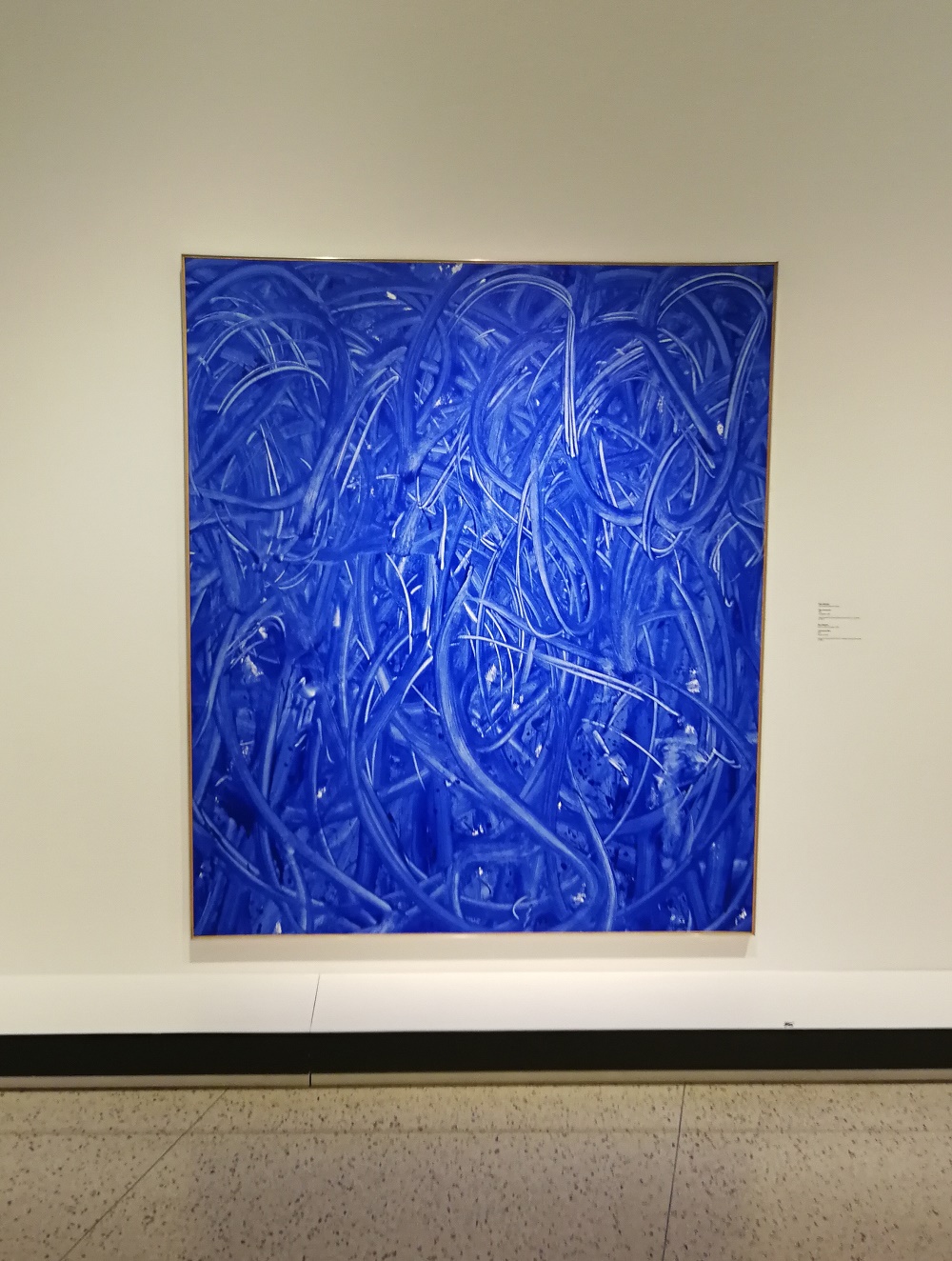
    Ultramarine Blue by Ron Martin

    Ultramarine Blue at the
    Montreal Museum of Fine Arts
    There was some very cool art but the piece that intrigued me the most was Ultramarine Blue by Ron Martin. Ron Martin in a Canadian artist living in Toronto. This piece, acrylic on canvas, was created in 1971. He explored working with one colour for ten years, from 1971 to 1981.  It started with Ultramarine blue and bright red and then he spent many years working with black.

    Although I'm not often attracted to monochromatic pieces, I just love the variations of the blue as well as the mouvement. It makes me feel happy and free. As usual with art that I like, I started wondering if I could use textile to create the same kind of effects.
    Ultramarine Blue by Ron Martin
    My Blue Painting

    I started by trying to create these lines of mouvement  with thread. I used darker thread to make lines and swirls for the background. I created many parallel lines to get the impression of brush strokes.  
    Creating the background mouvement using dark blue thread
    I added lines of lighter thread but it became obvious that using parallel lines of thread just isn't the same since the brush strokes are full of paint, not empty. So now what?
    Adding  lighter blue thread
    I went to my stash and made wider brush strokes using bits of tulle and gauze. Again, I started with the darker background and then added the lighter fabric. I think that it's starting to look more like brush strokes. Unfortunately this is as far as I can go since I only had a little bit of light blue tulle. 
    My Blue Painting so far
    What I learned
    • I love looking at art, but it's becoming clear to me that I'm always looking at it through my own textile lens. 
    • For example, I liked the Alexander Calder exhibit but all I wanted to do was add bits of streaming fibres on those lovely mobiles. 
    • It was great learning more about Ron Martin - turns out my daughter knew who he was! It's funny but as I looked at some of his work, there is definitely a textile vibe there, even if he works with paint.
    • My Blue Painting is my DrEAMi! project this month - as in DRop Everything And Make It!, the linky party hosted by Sandra at mmm! Quilts. I've missed the last couple of link-ups, so I'm glad that I'm on time for this one :-)
    • This week, between the Funky Square Flower Mola and My Blue Painting, I have two more WIPs to finish! I think that UFOs and WIPs are much easier to make than finishes 😊
    Related links
    Linking parties
    I will be linking up to DrEAMi!, with Sandra at mmm! Quilts and Free Motion Mavericks with Muv.  Don't forget to check the out as well as these other fun link-ups. Monday Making, Design Wall MondayMoving it Forward, What I Made Monday, Wandering Camera, Tuesday Colour Linky Party, Midweek Makers, Off the Wall Friday, Finished or Not Friday, Friday Foto Fun, Can I Get A Whoop Whoop? 


    Tuesday, November 06, 2018

    A White History of Art - Art with Fabric Blog Hop

    Welcome to the fall 2018 edition of the Art with Fabric blog hop. I'm thrilled to be participating again and would like to thank Alida for all of her hard work :-)

    A White History of Art

    A White History of Art
    When Alida said that the theme would be colour, I'm not sure that I saw the "favourite" in front of it. For me colour is everything! I had a few ideas and when I mentioned them to my daughter, she suggested that I watch the BBC documentaries, History of Art in Three Colours. It was a great series that examined the role of gold, blue and white in art. I made notes on each documentary but the third one had me sketching - a very good sign!

    I knew that I wanted images representing the shift in how we see art that was partially caused by the role of the colour white in art history.

    The premise of the White documentary is that during the Renaissance, white art, particularly the sculptures of the Greek and Roman times, were seen as representing purity, simplicity, and elegance. White slowly evolved to represent the elite art of the establishment and eventually the superior white of conquerors.

    The White of the Renaissance

    The top corner images represent the Greek and Roman marble sculptures that were so admired from the Renaissance to the early 19th century.
    Marble bust of a Goddess
    In the top space are free motion quilted or embroidered words: purity, elegance, virtues, and simplicity. 
    Marble torso of a man
    In the top centre is a piece representing a white honey dish, made by the potter Josiah Wedgwood. Wedgwood experimented for years before coming up with the perfect white glaze for pottery.
    White honey dish in a style made by Josiah Wedgwood.
    White as elitist

    The purity of white that was so revered from Renaissance, slowly changed from elegant and virtuous to represent an elitist, cold and sterile perfection in the modern era. As described in the documentary, one of the artists who started art's journey toward this exclusive and elitist path was James Abbott McNeill Whistler, an American who lived mostly in England. 
    Representation of a Symphony in White, No. 1: The White Girl by Whistler
    Through his paintings and the manner in which he displayed his art, Whistler represented a world where art was less approachable and more exclusive. He was one of the first artists to present his paintings on white walls with large spaces between each painting. Before this time, paintings were usually hung on walls with very little space between them, almost from floor to ceiling. 

    This change, which was eventually called the white cube, resulted in art galleries, and the art within, to be seen as special spaces that were less accessible to the general public. The image below is the White Cube.
    White cube - a huge shift in how we view art
    During the years that followed, many modern artists started rebelling from this view of art. One of these is my daughter's favourite artist, Marcel Duchamp. In 1917 he created Fountain. My image isn't that obvious but it's a very white porcelain urinal. This was part of Duchamp's use of "ready-mades", everyday objects seen as art.  
    Fountain - questioning what we see as art
    From Duchamp, the documentary takes a journey to the fascist environment in Europe around the Second World War. It would seem that Hitler, Franco and Mussolini were huge fans of the purity of white marble. They had buildings, sculptures and monuments built to represent the new era. At this time, white is seen as austere and superior - the blanc moral. It is the colour of conquerors. 
    The fascist view of white art
    The White documentary approached the history of art from a different point of view. I found it all very fascinating. My hope for the future is that art starts being more accessible as it is shared and seen across the world through the internet. I also believe that the definition of art is also changing as people who would never have considered themselves artists a couple of decades ago are now seeing themselves and are being accepted as such. I suspect that the white history of art is far from finished!

    What I learned
    • The background is an improvisation of white and off-white batiks that I used to make the background diamonds of the Kingfisher Stitch-Along blocks. 
    • I used many techniques to create this piece. I started with the centre panel of the White Girl. I wanted to make her three dimensional since there is no reason for a dress to be flat! I even pleated the top of her dress. It took a lot of experimenting but eventually I managed to get it all together.
    • Next came the marble torso and bust. For the torso, I was able to use an image, freezer paper, a light box and free motion quilting (FMQ) to get a fair semblance of a ripped torso. I didn't have any luck with that technique for the bust of the Goddess. I ended up using some photo transfer medium to create it. Unfortunately it turned out more grey than white. I covered it in white gauze to get a paler colour.
    • The white honey pot was a lot of fun to make. I used a shimmering tulle for the background and then used some shiny sheer fabric for the pot. I even added some metallic thread through the bobbin in the FMQ. Finally I found some perfect lace to go around the tulle to give it the look of a table cloth.
    • The fountain was next. In hindsight, I wish that I had chosen an image that showed it from a different angle so that it looked more like a urinal. I used a rougher, looser woven fabric for the background, with the look of burlap - to contrast with the shininess of the satin of the Fountain.
    • The last two images were commissioned by Mussolini. There is the marble obelisk which has Mussolini's name engraved upon it and the marble statue of a boxer at the Stadio dei Marmi in Rome. 
    • I added words that were used in the different eras to talk about white. Some are embroidered while others are FMQ. The latter are much more legible but the embroidery adds texture.
    Related links
    Linking parties
    I will be linking this post to many linky parties. Why not check out what everyone else is doing? Below you will find the links to the other participants in the blog hop. Check out the great art with fabric😊  Tuesday Colour Linky PartyLinky Tuesday, Midweek Makers, Off The Wall Friday, TGIFF, Can I Get A Whoop Whoop?, Friday Foto Finish, Finished or Not Friday, Needle & Thread Thursday, Finish It Up Friday, Monday Making, Main Crush Monday, Design Wall Monday, Moving It Forward, What I Made Monday, Wondering Camera

    Project details


    A White History of Art, based on the History of Art in Three Colours, WHITE
    17½" x 17¾"
    Materials: batik, cotton, satin, tulle, gauze, lace, burlap-type fabric, stabilizer, embroidery floss, beads, felt, metallic thread, Kimono silk thread
    Techniques: photo transfer medium, improv piecing, markers, beading, embroidery, appliqué, FMQ, thread colouring.

    Art with Fabric Blog Hop Schedule

    Monday, November 5, 2018 - Day 1
    Tuesday, November 6, 2018 - Day 2
    Wednesday, November 7, 2018 - Day 3
    Thursday, November 8, 2018 - Day 4
    Friday, November 9, 2018 - Day 5