 |
| Quilting Arts Magazine |
 |
| Landscape Art Quilt |
Since I've also been reading about the usefulness of working in a series, I thought that this project would be Lone Tree 2.
On the drive home from work in early fall, I saw a very red maple tree in a small clearing. It caught my attention because although it was very red, all of the trees behind it in the forest were green. None of them had started changing yet.
I took out my sketch book, drew a very quick picture and wrote "I'm tired and I want to rest - or Overachiever?" Was that tree looking to go to sleep early or was it an overachiever, trying to beat everyone to the fall pageant?
 |
| Red tree foliage made of snippets |
I took out all of my green thread (polyester, cotton and silk), and started free motion quilting (FMQ). I wasn't thrilled with the background but couldn't wait any longer - I had to create the red tree.
I cut the batik fabric I had chosen into very small snippets. I placed them where I wanted the tree foliage and proceeded to FMQ over them. I was surprised by how much fabric it used up! I then created the tree trunk.
 |
| Adding limbs to the trees helped! |

As I examined the green background I wasn't sure what was wrong. On my way to work the next day, I looked at the forest and noticed that no matter how thick the foliage, there was always tree trunks and branches showing. So I took out my brown, black and grey thread and added some limbs. It really helped!
 |
| Lone Tree 2 - what now? |
I took out my embroidery floss. I had FMQ some blue flowers in the foreground, so I added some lighter green grass and more blue.
I looked in my bags of scraps and found a bunny, a butterfly and leaves. Getting much better. The white bunny added contrast. Now the viewer sees the tree, wonders off to the bunny, catches a glimpse of flowers and the butterfly and can keep exploring.
 |
| Lone Tree 2: I'm tired and I want to rest - or Overachiever? |
- I thought that the dark green background would be fine because green and red are complimentary and contrasting colours. It would seem that I forgot about the value of colours.
- In her article, The Value of Value (Quilting Arts Magazine Oct./Nov. 2016), Grace J. Errea writes "if there is a problem, look for a value solution first."
- Read parts of her article in this blog post: Quilts Design: The value of value
- She suggests that a successful design should have tints (lighter versions of colours), shades (darker versions of colours) and intermediary values.
- The article is very informative and easy to understand. She also uses a Value in Colour Chart that I will make from scraps to remember my value lesson.
- Although it was a little late to change the values in my landscape art quilt, adding the appliqued elements, the lighter green embroidered grasses and blue flowers gave my piece some tints to contrast the mostly darker tones and added some visual interest.
- Using a photo probably helps to avoid some of these errors because I would be more likely to notice the lack of value in a photo and adjust accordingly.
 |
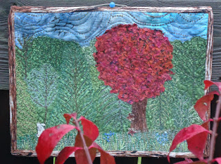
| Lone Tree 2 behind the burning bush. |

A really inspiring piece! Thanks for sharing all the lessons you learned along the way!!
ReplyDeleteThanks Alida. Always lessons to learn!
DeleteYes, thanks for sharing your journey. And for linking up with Oh Scrap! Aren't the trees lovely this time of year!
ReplyDeleteHi Cynthia, it's my favourite time of the year - the colours are gorgeous!
DeleteThanks for taking us through your process and thinking. It helps me to learn more. I am always conscious of value and wish more quilters understood how to make things come alive using contrast. An excellent tutorial.
ReplyDeleteThanks Paula. It certainly was a learning experience. Hopefully I can keep putting this one into practice.
DeleteLoved reading about your process! It's always interesting to see how things come about.
ReplyDeleteThanks Cathy, so do I. I also find that thinking and writing about the process makes me learn so much more. Thanks for dropping by!
DeleteSo pretty! Great inspiration too - thanks for sharing on Midweek Makers
ReplyDelete